How To: Create a Wind Rose Diagram using Microsoft Excel
Using Excel to make a Wind Rose – A step-by-step guide
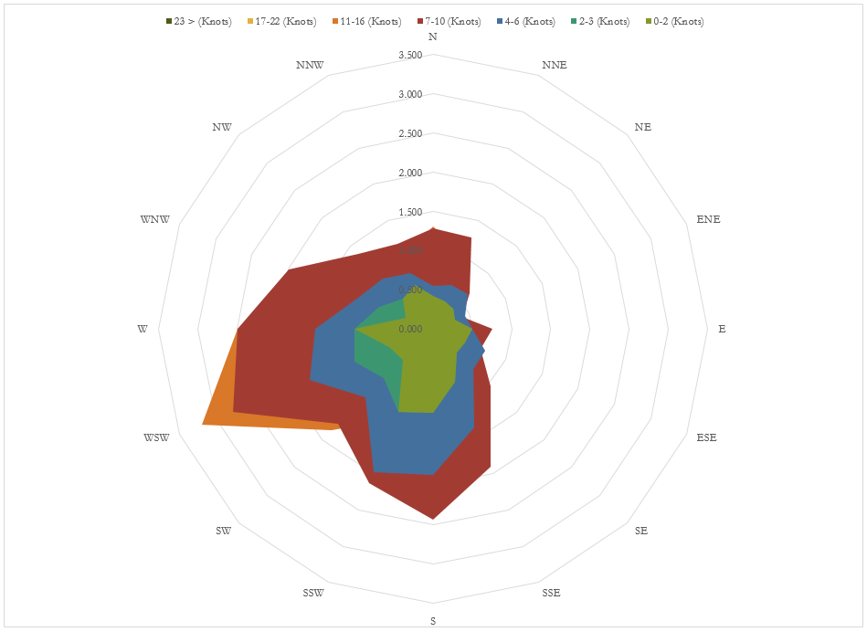
It is possible to make a wind rose (of sorts) by using excel only. You will end up with a plot looking like the example given below:
The process is fairly long and tricky, and the end result is not the professional Wind Rose that you would produce when using the WRE Web App or WRE v1.7.
However, in the name of providing a good service for our website viewers, we have include the procedure below.
1. Wind Data
You will need to source the appropriate wind speed data which related to a specific location and, ideally, height.
The data will need to comprise of mean (normally hourly) wind speeds values and the associated wind direction values. For example, you may have access to hourly mean wind speeds and direction taken for the last 2 years.
The data may look like the following:
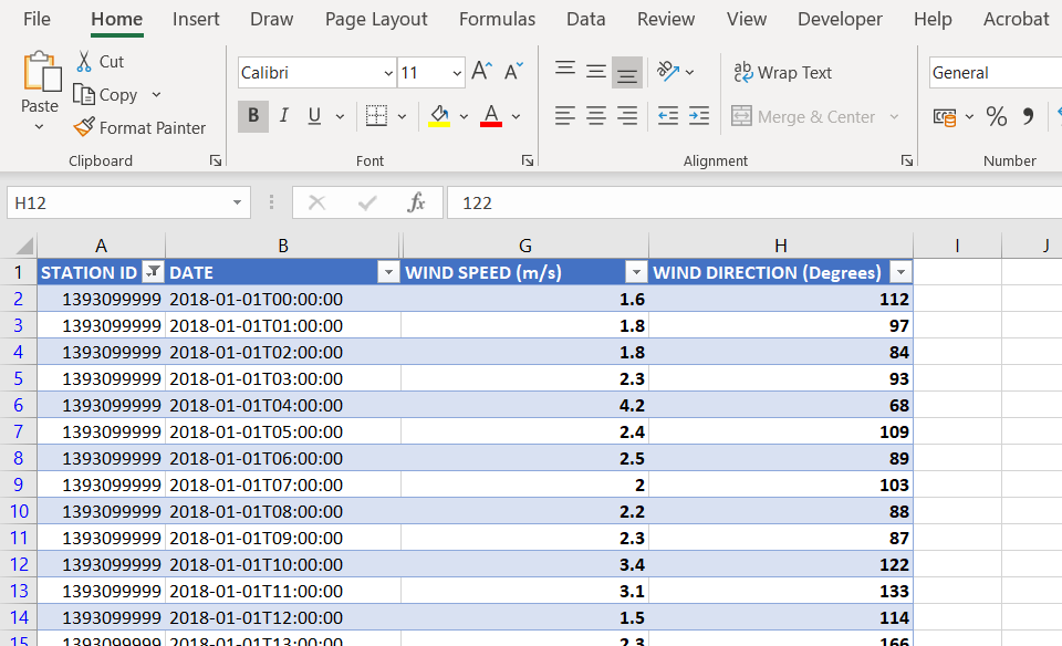
It is then important that the wind direction is converted from degrees to Cardinal Wind Directions i.e. N, NNE, NE, ENE, E and so on. Click here for more information.
2. Ensure that ‘0 m/s’ wind speed values have been taken into account
In order to do this you should ensure that any mean wind speeds which have values of 0 have been assigned the wind direction “Calm” (or something equivalent). The calm data is excluded from the wind rose diagram and is explained further in Section 10.
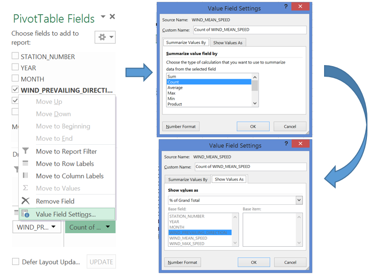
3. Insert a PivotTable
Select your wind speed table (the 2 columns containing wind speed and direction values) and click the ‘Insert’ tab and then select ‘PivotTable’. Create pivot table in new worksheet.
4. Arrange the wind speed data into a summary table using the PivotTable Toolbar
- Drag the Mean Wind Speed field into the ‘COLUMNS’ area of the ‘PivotTable Fields’ toolbar
- Drag the wind direction field into the ‘ROWS’ area of the Pivot Table Fields toolbar
- Drag the Mean Wind Speed field into the ‘∑ VALUES’ area of the Pivot Table Fields toolbar also.
5. Ensure that the rows in the summary table are in the correct order
In the Pivot Table, drag the new Row Labels into the correct order, I.e. N, NNE, NE, ENE and so forth.
6. Countif Function
Use countif function to count the number of occasions the wind speed falls within each bin for each wind direction (see below)
7. Display the data as Relative Frequencies
In the ‘∑ VALUES’ area of the Pivot Table Fields, convert the frequencies into relative frequencies (each frequency / total frequency).
8 Transform the columns in the summary table into the appropriate wind speed bins
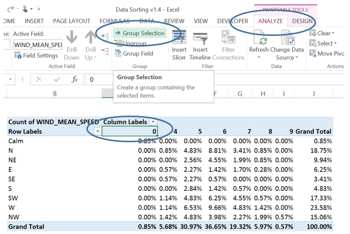
9 Grouping the Column Labels (Wind Speed) into bins:
- Select the column Labels in the pivot table
- Select ‘ANALYZE’ or ‘OPTIONS’ in the ‘Pivot Table Tools Tab’,
- Click ‘Group Selection’.
- Enter your range in the ‘Starting at:’ and ‘Ending at:’ fields, select your bin size in the ‘By’ field, and finally click ‘OK’.
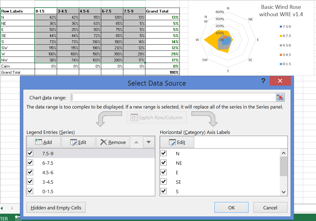
10 Insert a ‘filled radar plot’ using the summary table
Copy and paste the data out of the pivot table into a separate worksheet.
You will need to convert each row into cumulative frequencies
Select the data you want to turn into a wind rose (make sure that you do not select the “Calm” row)
Once you have inserted the radar plot, you will need to re-order the series to make sure all areas are visible
You should end up with something like similar to the following:
If this is too time consuming, or you are not happy with the results, try subscribing to a free trial for the WRE Web App. Or if you have data available to you already, you can purchase WRE v1.7.