Wind Rose Diagrams Made Easy
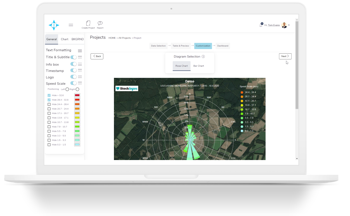
Wind Rose Excel aims to provide a simple, intuitive and powerful solution for wind speed data analysis.
Find the best solution for you.
Get started

Functionality and features
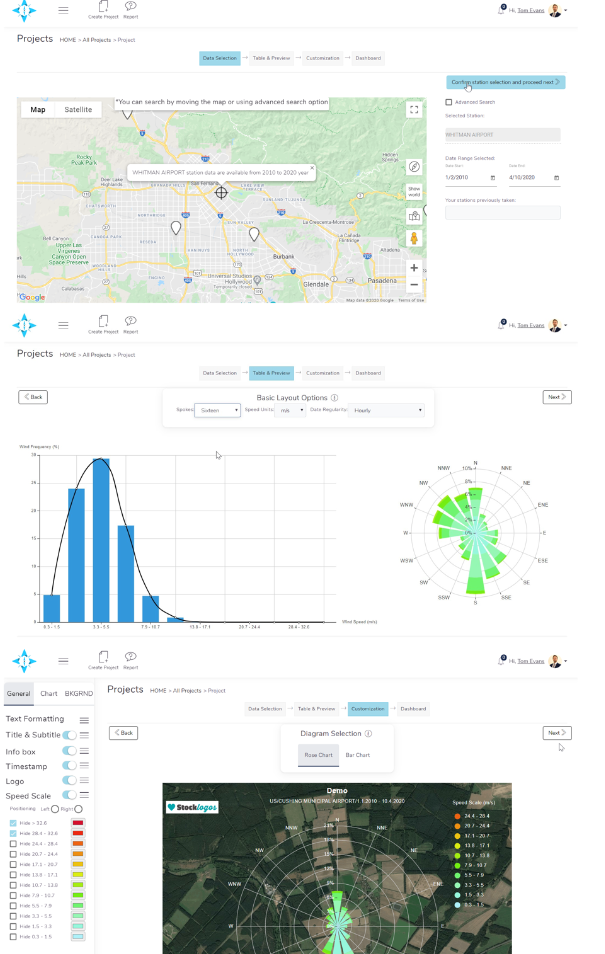
Access data from over 30,000 global stations
Wherever your project may be in the world, we aim to have a data available to you.Create your own library of data
Additional locations can be added to your own data library. Your library will be updated with new data every week.Analyse your data
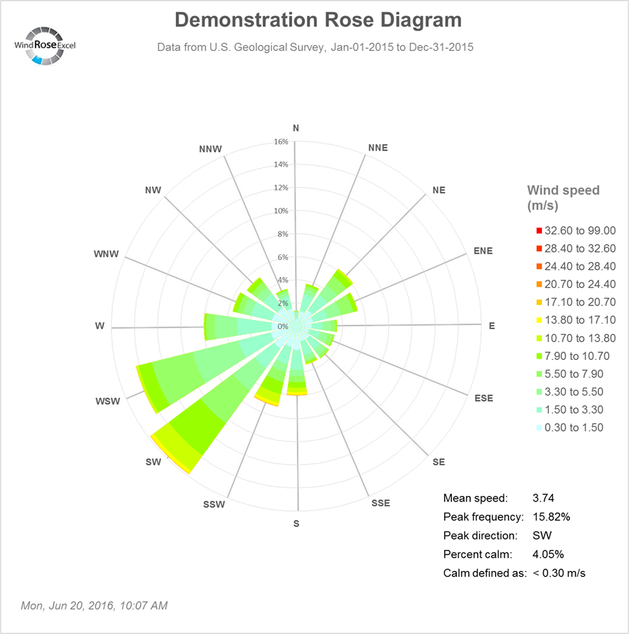
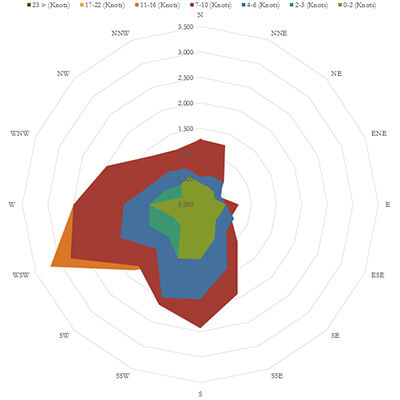
We allow you to turn raw data into a visual tool for your projects.Present your data
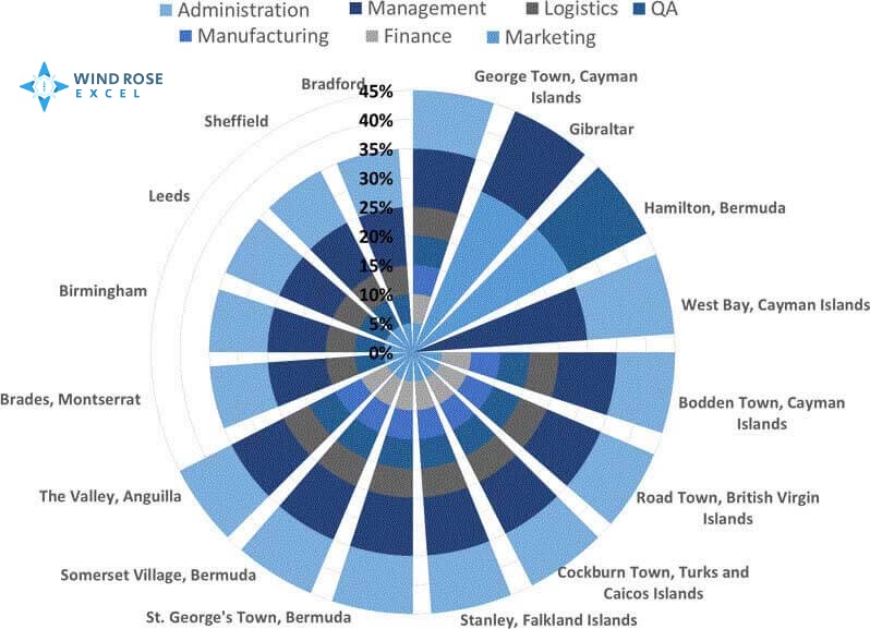
Charts and tables can be downloaded or embedded into your own website.
What clients says about us
Please note that since 2014 we have sought to provide downloadable products for our customers. From 2020 onward, we have moved to providing an additional online solution for our costumers. The reviews for all of our products speak for themselves:
Our partners


Try it now!
 Launch WRE App
